“Co-Bridge” Remote Customer Service
Job Matching: The app features a job matching system that helps prospective customer service candidates find positions that align with their skills, availability, and career preferences. This system considers the specific needs and constraints of the users, making it easier for them to engage in meaningful and rewarding work.
Multilingual Support: The app incorporates one-click greeting features that remove language barriers, allowing customer service representatives to interact with customers in multiple languages.
Flexible Scheduling: Designed with flexibility in mind, the app accommodates part-time schedules and allows representatives to work at times that best fit their personal commitments, promoting a work-life balance.
Enhanced Data Management: The app is equipped with advanced data collection tools that enable precise tracking and matching of customer queries to the most suitable texts and responses. This ensures a tailored experience for each customer while providing manufacturers with valuable insights into customer needs.
Performance Measurement: Effectiveness is measured through the tracking of average problem-solving time, ensuring that each case is handled efficiently and improvements are continually integrated.
Format: Mobile App Design
Feb 2024 - May 2024


Gambling, human consciousness and culture
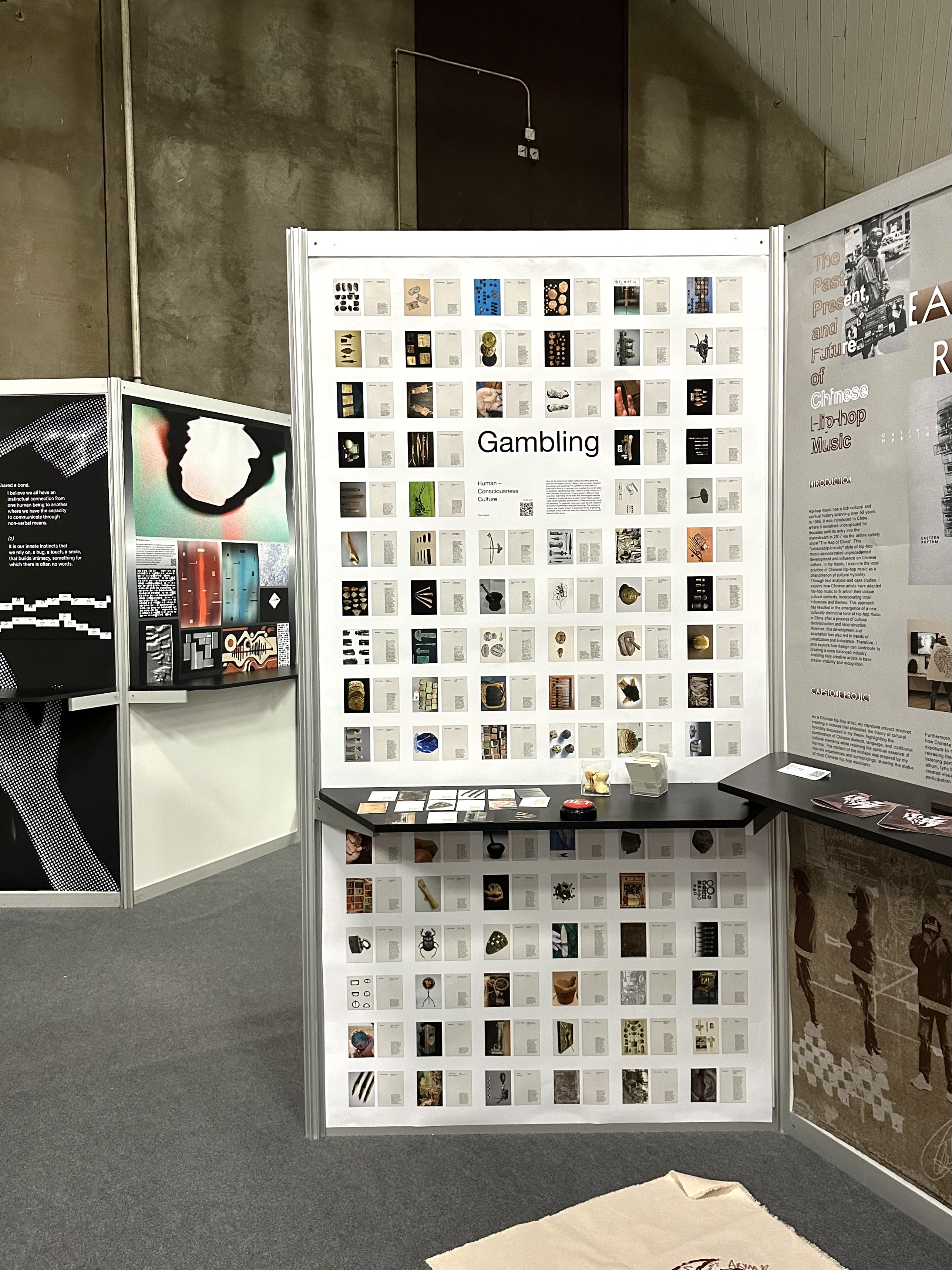
The economy is on the path to recovery from the pandemic, and both online gambling and casinos are showing an upward trend in statistics, particularly with the surge in young addicts. To understand the root of the issue, I delved into the beginning of human evolution and explored the connection between gambling and human instinct. I examined the formation of gambling tools and the human tool system, as well as the early development of human consciousness in design thinking. The answer to this problem may likely point to critical thinking, consciousness, and information.
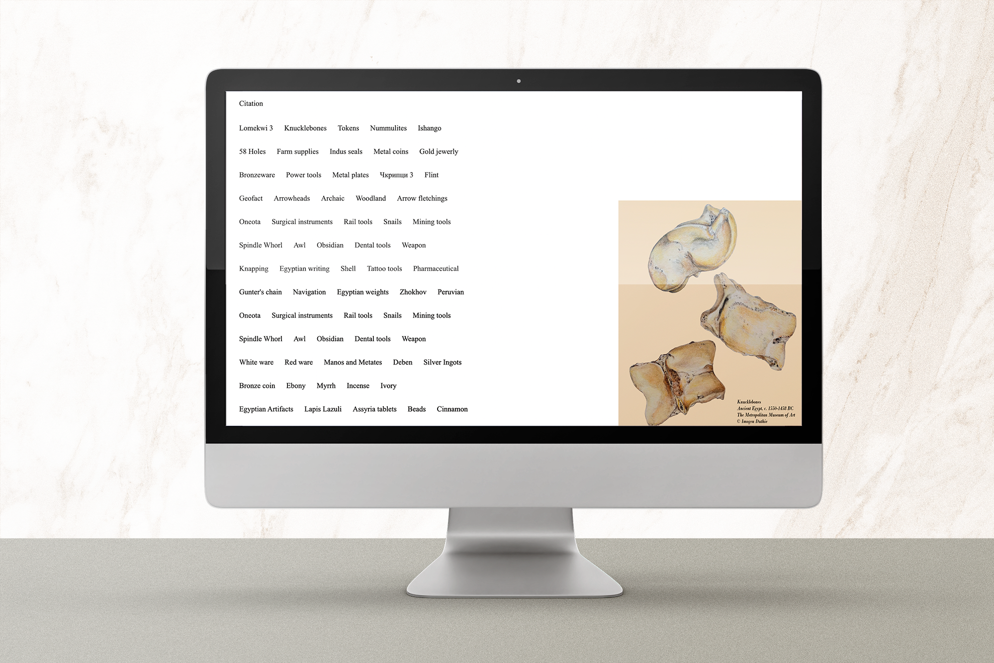
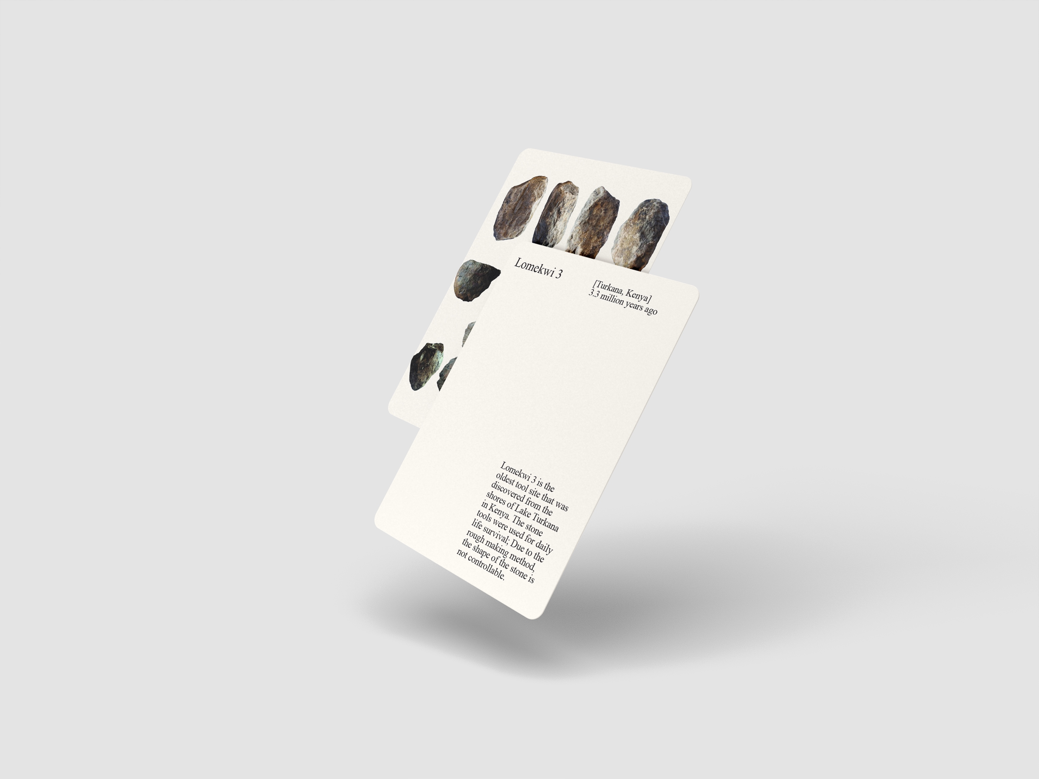
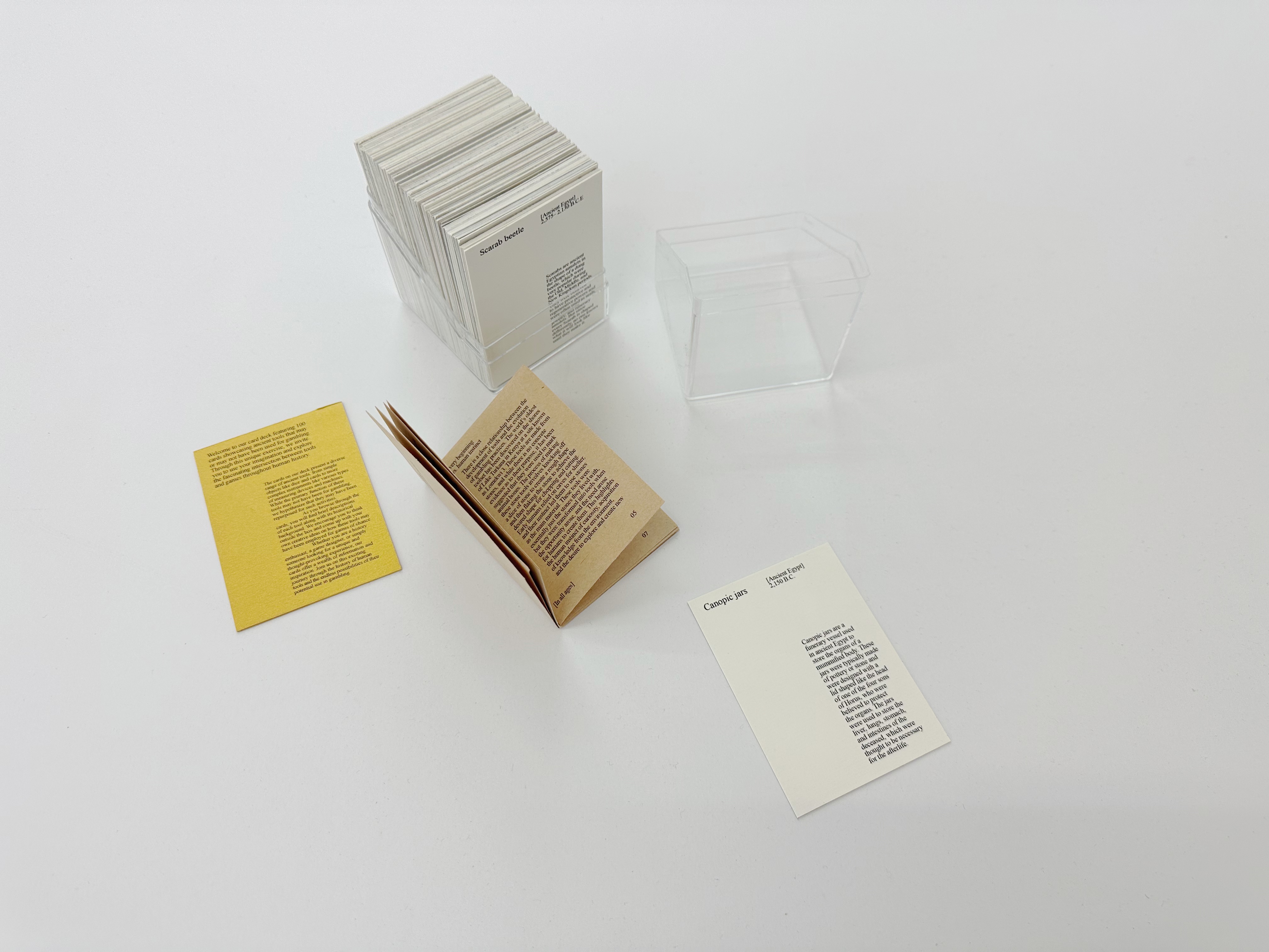
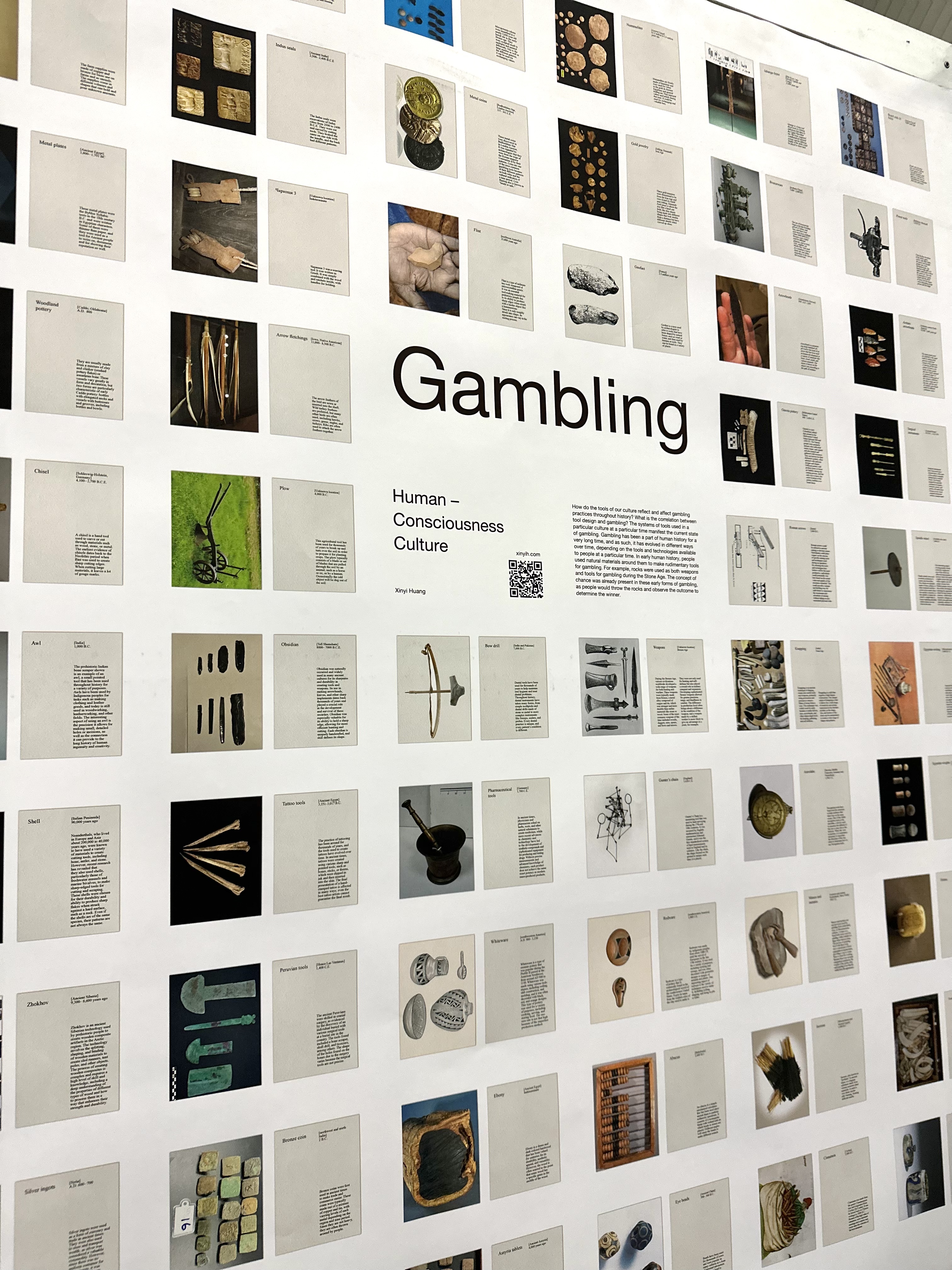
“100 gambling tools” in history:
Gambling has existed since the very beginning of human history, as it aligns with human instinct. With the formation of tool systems, early humans made use of their surroundings to create tools for both survival and gambling. The first recorded gambling tool in history was the knucklebones, a symmetric bone from sheep that perfectly fit in hands. The idea behind knucklebones is similar to the modern bet button, matching the human body's mechanism and instinct. Deconstructing gambling to its essence reveals important information about the formation of human consciousness for design ideation. Although some tools are no longer used and have become obsolete, their mechanisms continue to exist in another form, as humans and technology have progressed throughout history.
→ Website
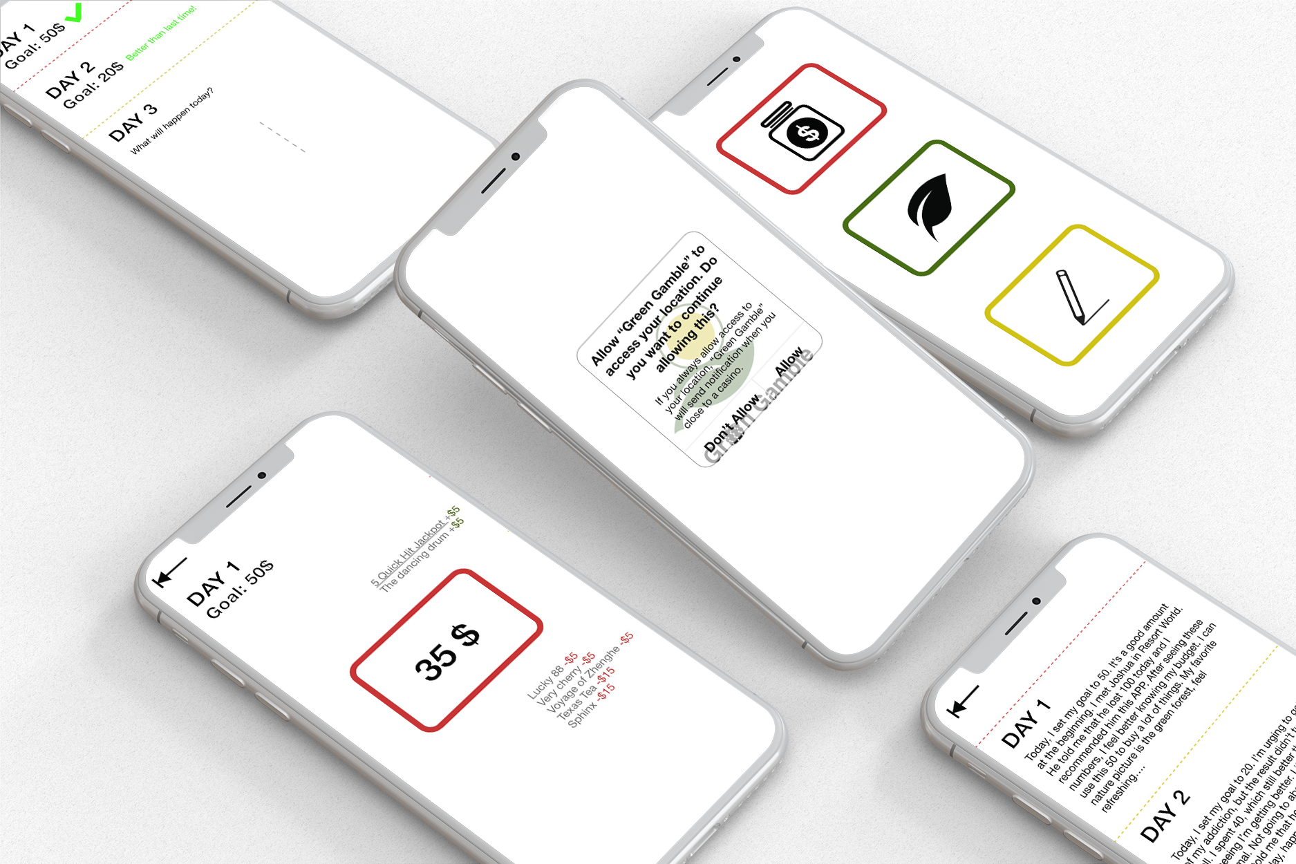
“Green Gamble” APP:
Responsible gambling App for gamblers to relieve from gambling addiction;
Functions: Budget (better financial), let gamblers have the direct consciousness of losing money; Nature, decreasing dopamine; Diary, document and archive everyday achievement.
Design: buttons (imitating betting button), international icon (globalization of gambling), colors from happy color psychology.
Format: research, cards, booklet, survey, App
Jan 2022 - May 2023


“A space to another space”
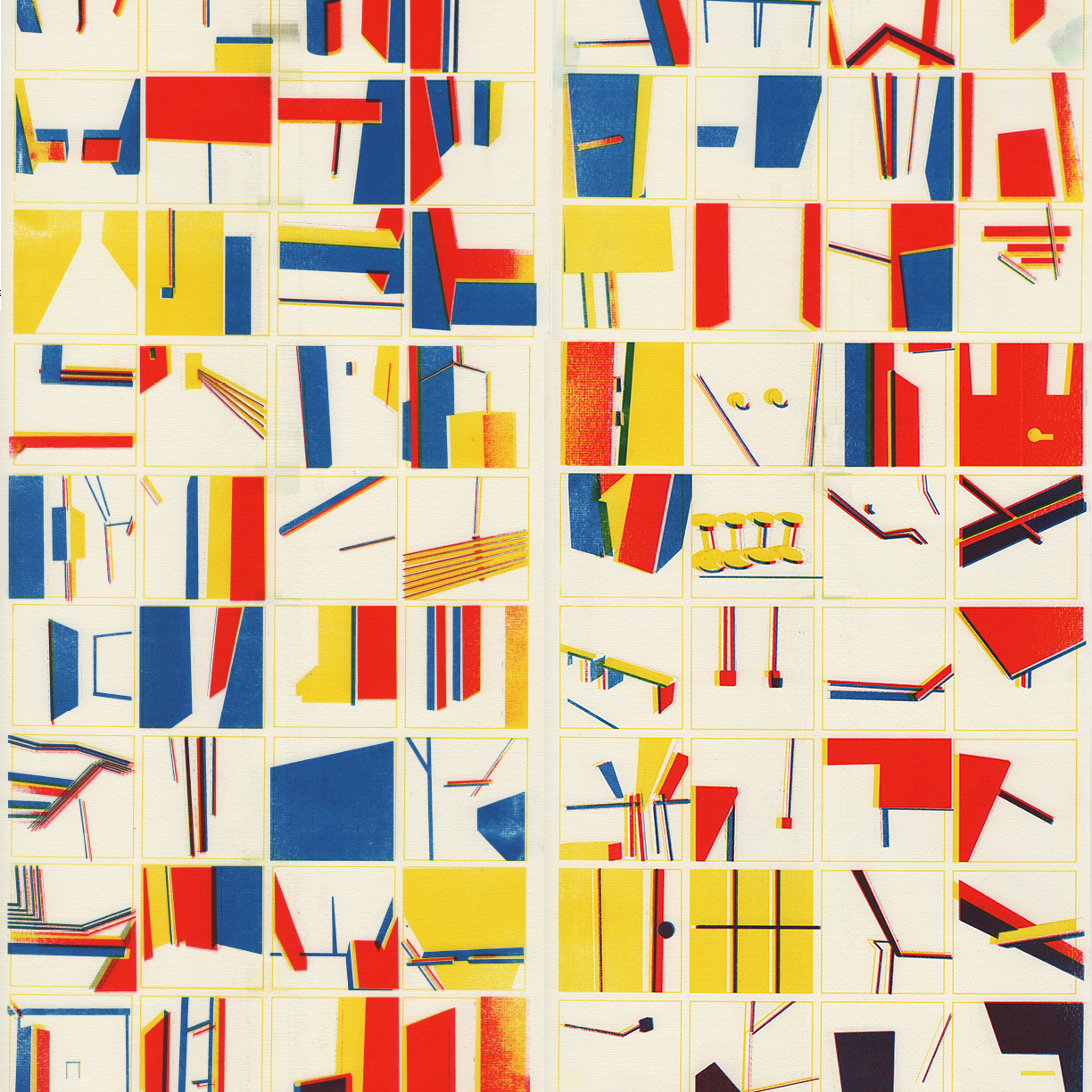
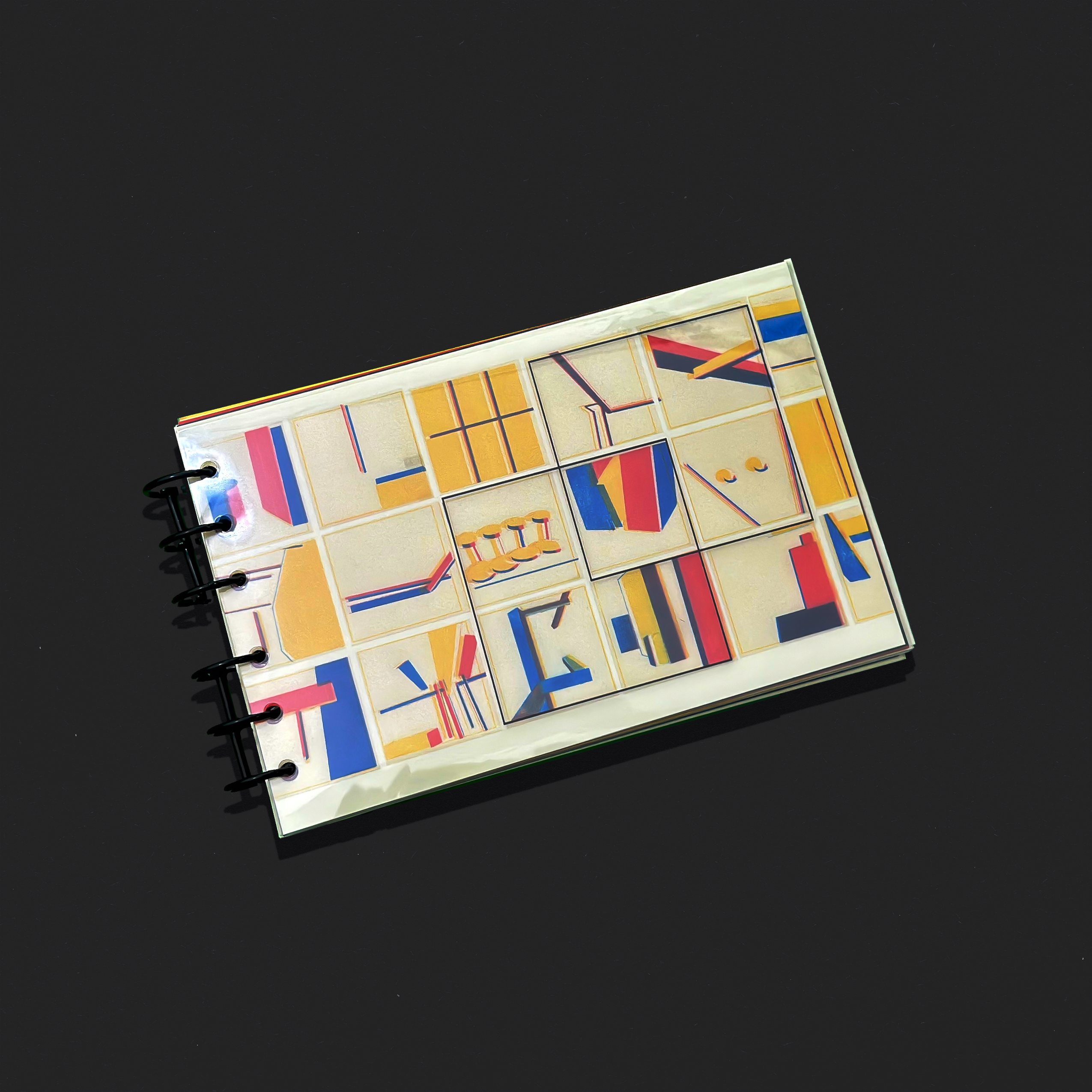
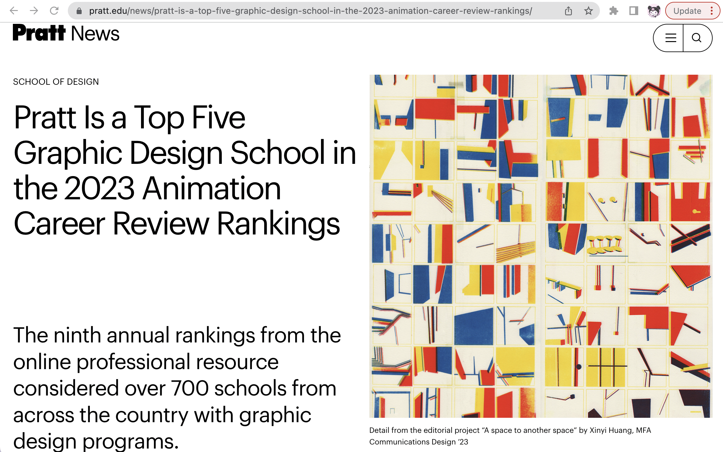
In this project, I explored the spatial relationships, structure, and dynamics of the building I work in. The industrial structrure of the building is used as a material and becomes the main protagonist of this visual story. This project was inspired by Jennie C. Jones "dynamics," at the Guggenheim museum in 2022 and Lygia Clark's Bicho.
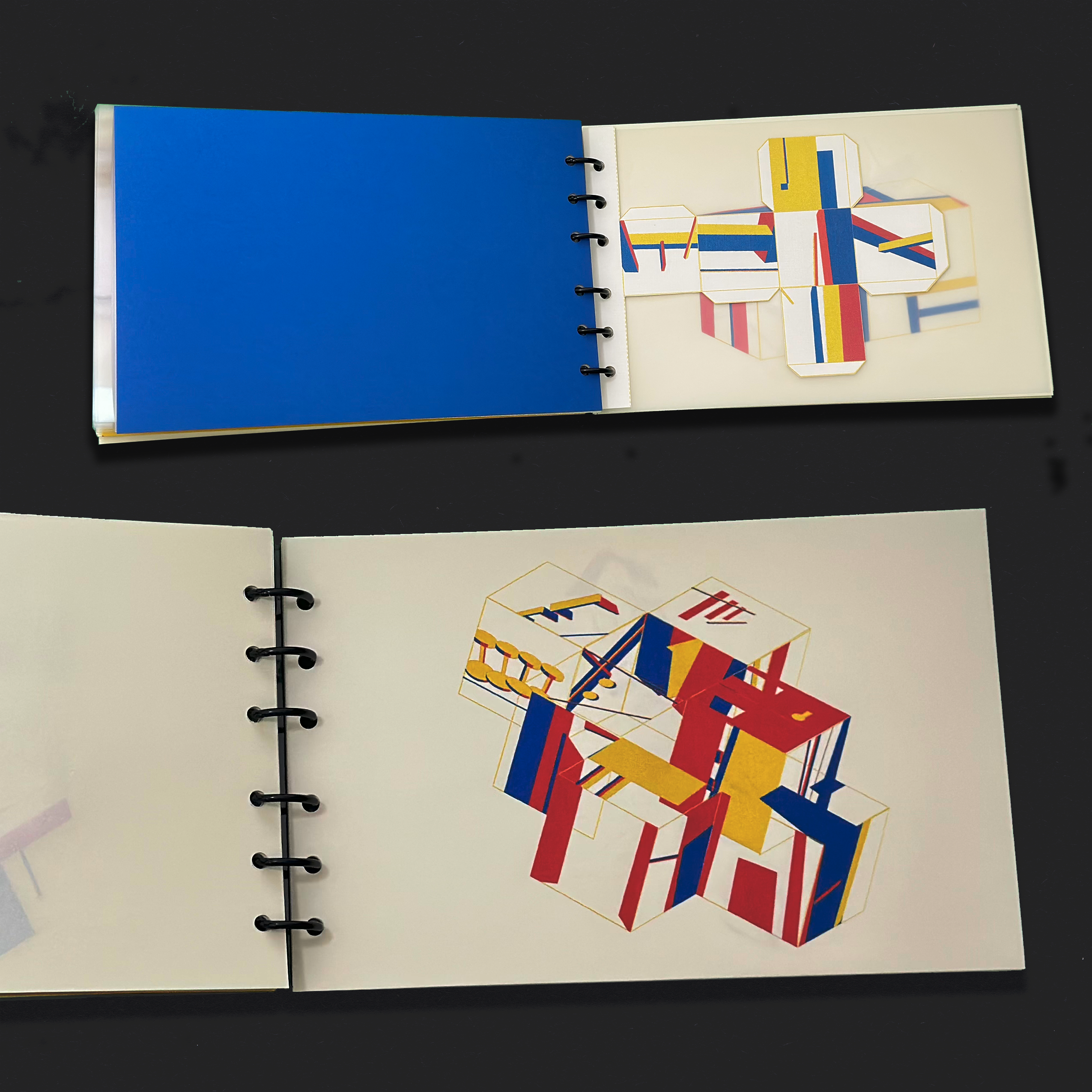
I have divided this booklet into three parts, with primary colors as the main theme. The cover and back were created using Riso print and then scanned down, with two square outlines on top to represent spatial transformation.
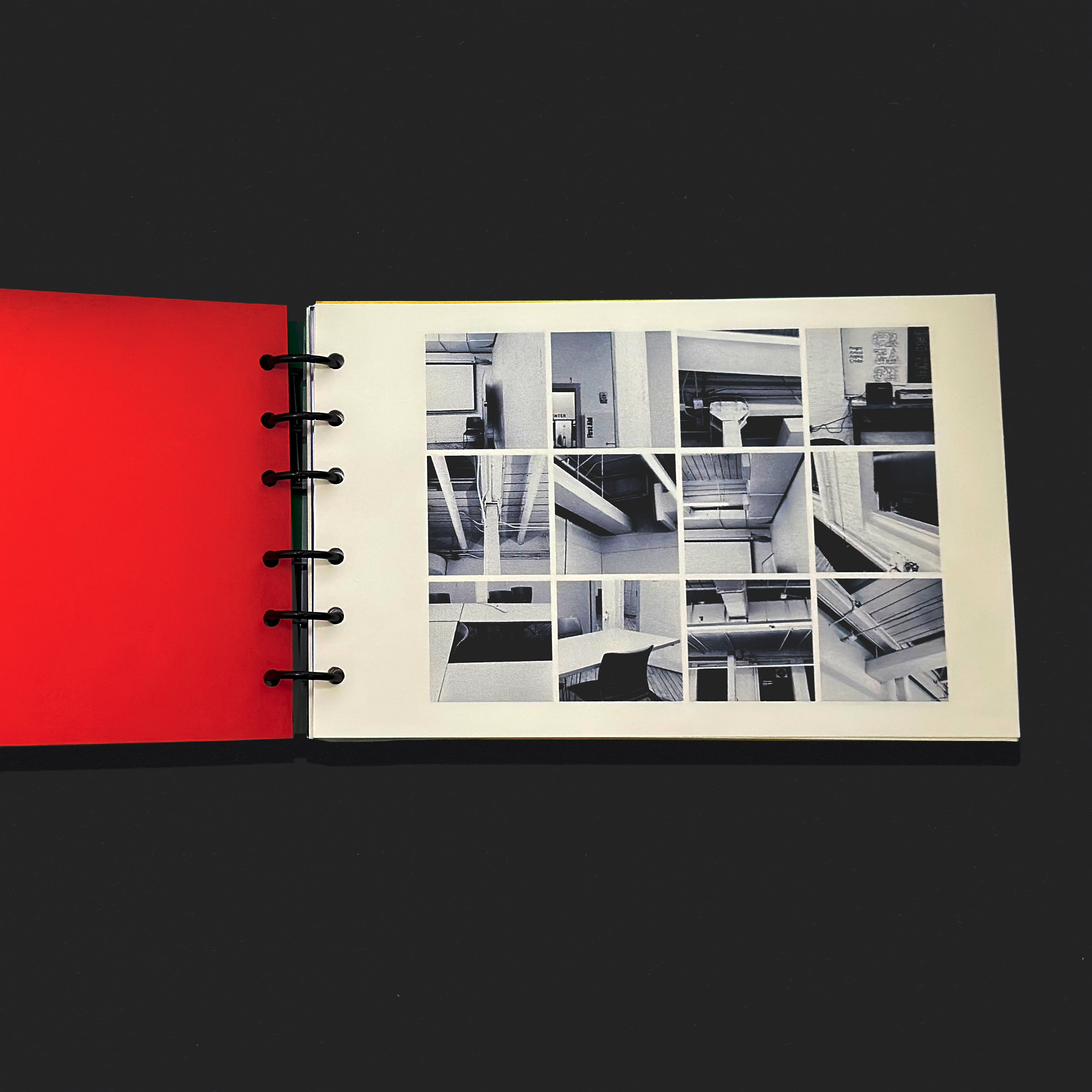
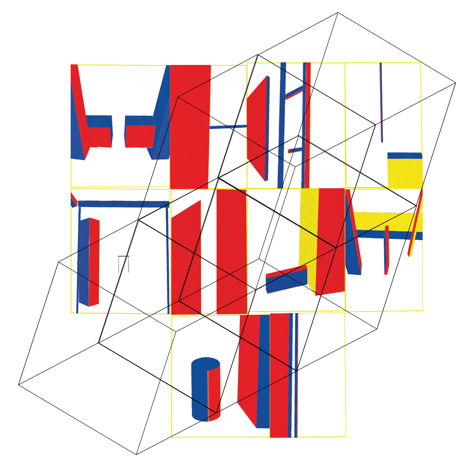
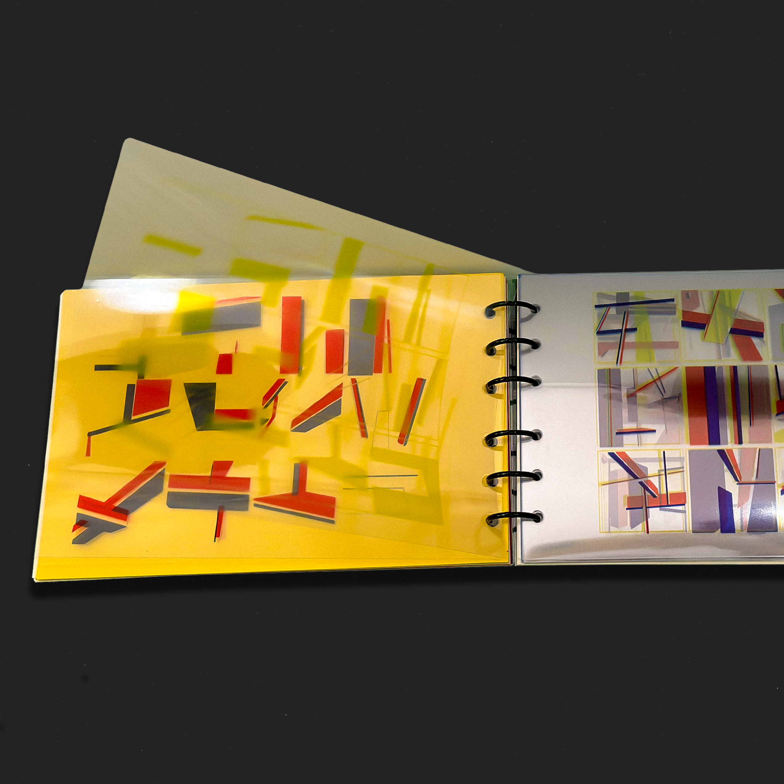
The first part showcases the documentation and transformation of photos. I used 3D shapes to trace the photos, and the front and back side provide a comparison of the photos before and after the conversion; The second part focuses on layering, using transparent paper prints to explore depth and create a new space. Viewers can turn the page to the left side of the yellow background to stack layers and view the artwork from different angles; The final part showcases connection by using a prototype cube to transition from 2D to 3D. Each side of the cube features a pattern, which can be connected and rearranged to create unique combinations.
→ Pratt Website
Format: photography, graphic booklet, riso print, multi media
Jan 2023 - Feb 2023

"Which furniture to choose?"
The inspiration behind this project came from my visit to a furniture store, where I noticed that despite the availability of colorful and diverse modern furniture, traditional, vintage, and utility furniture remained more popular among people. Intrigued by this observation, I decided to delve deeper and conducted research, which culminated in the creation of a newspaper guide featuring interesting possible answers and solutions to people's confusion when choosing furniture. Eventually, I transformed this guide into a digital app.
To achieve the desired design, I utilized traditional serif fonts for the "why traditional" section, a two-column grid layout, marked labels, and included one page for corresponding pictures.
Format: newspaper, typography, App, research
Jan 2022 - May 2022


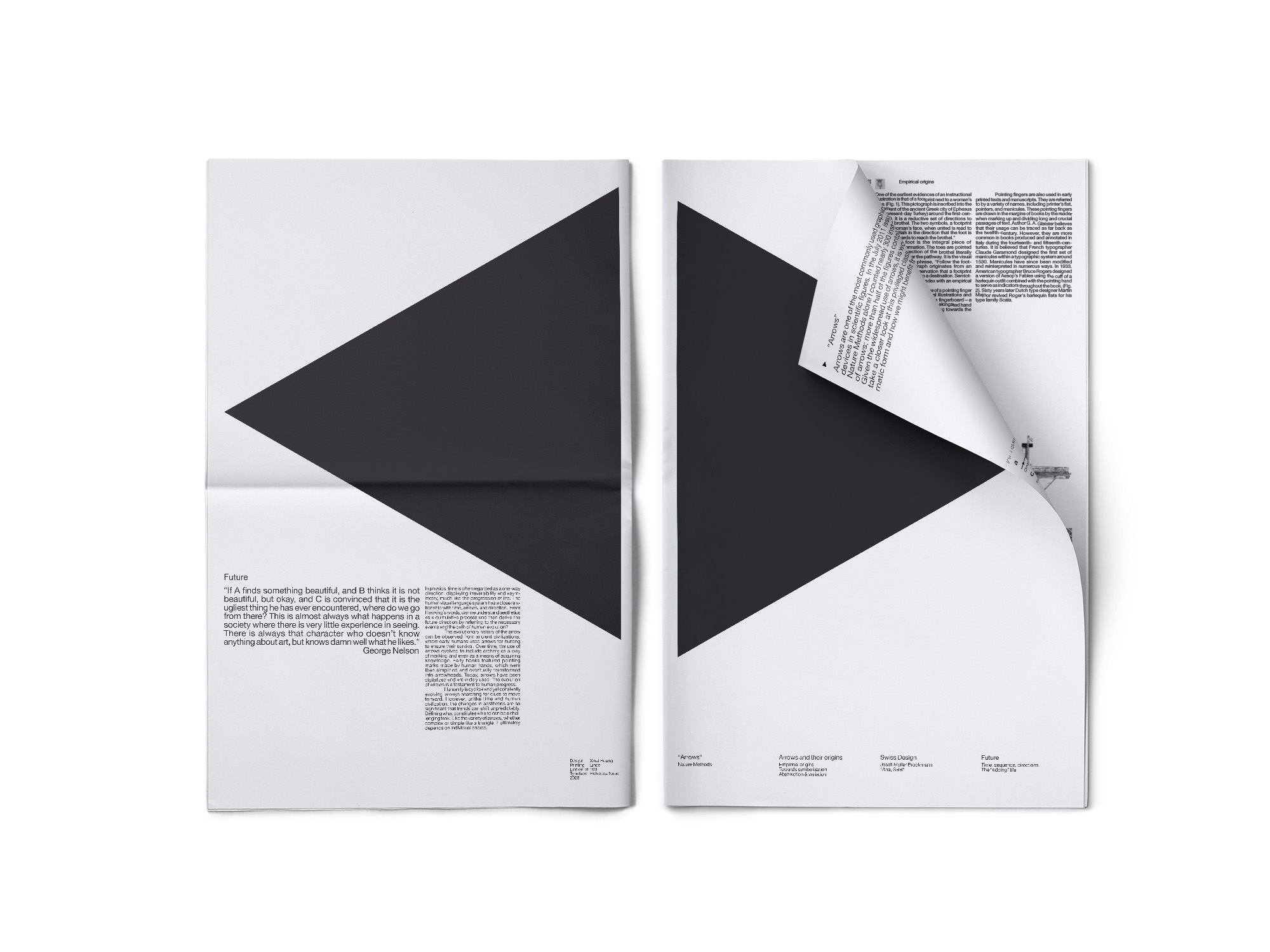
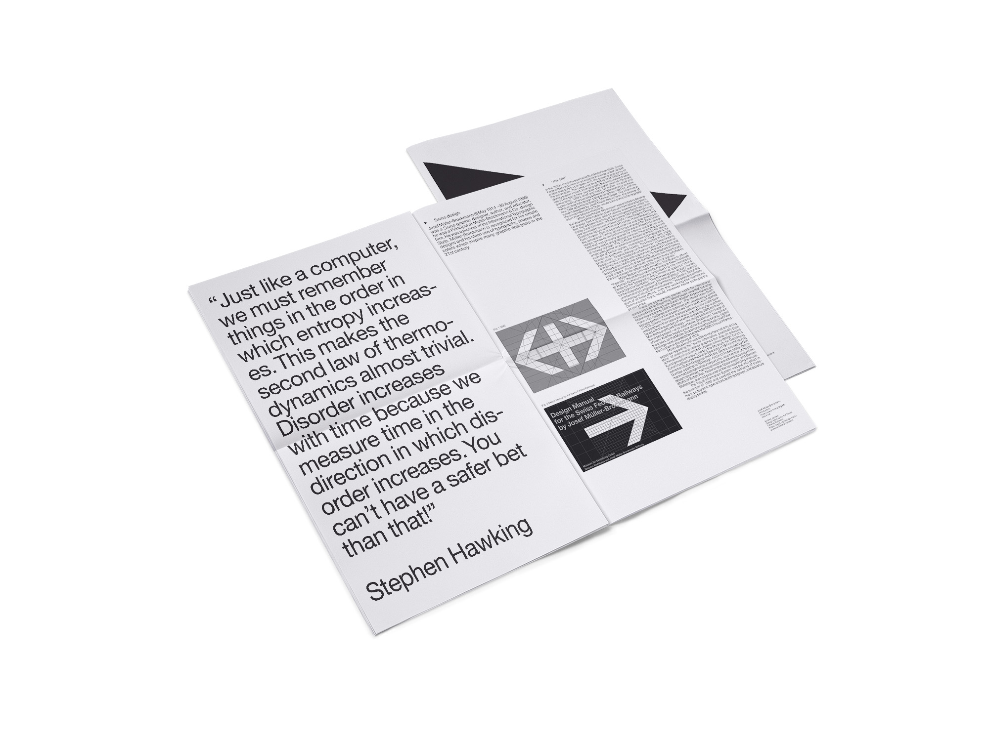
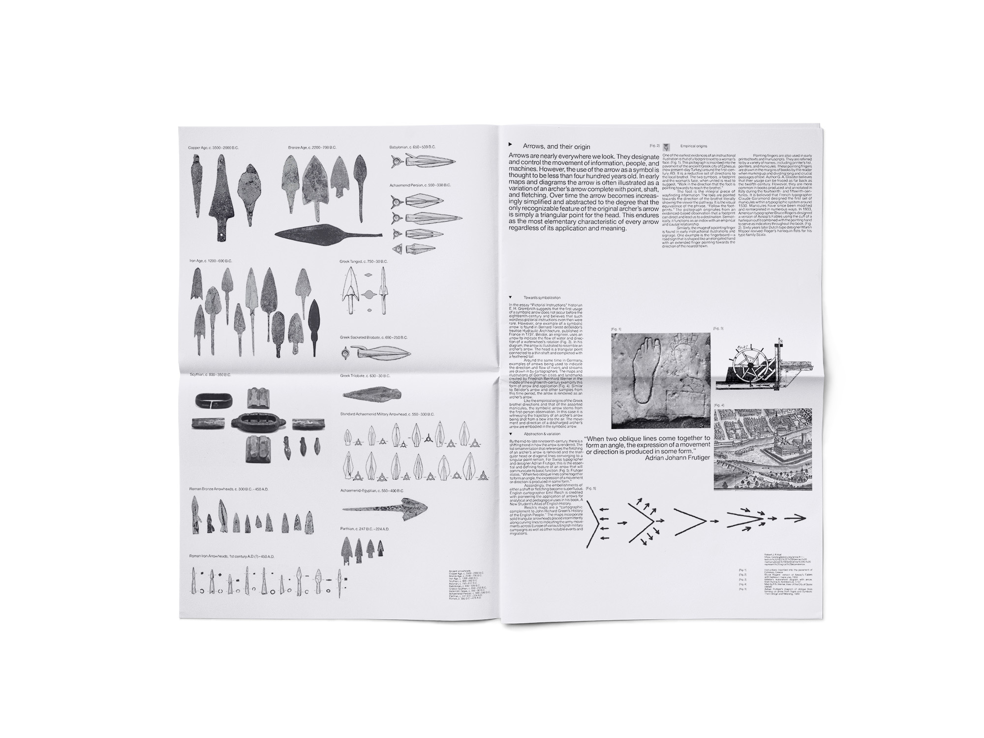
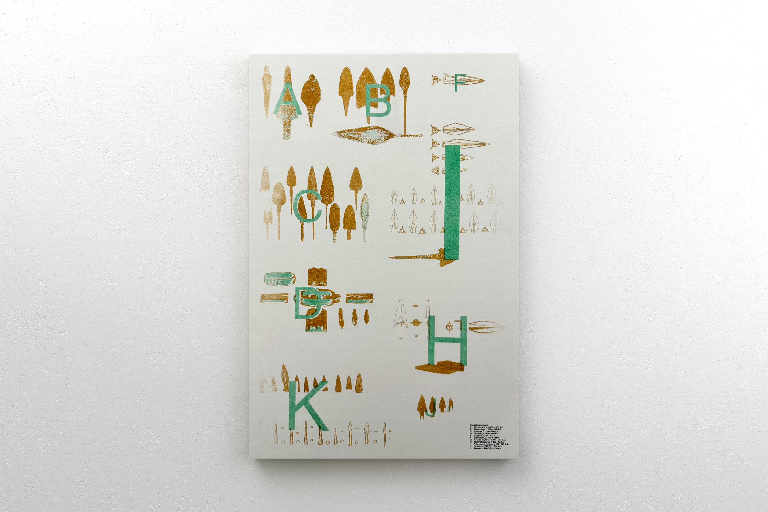
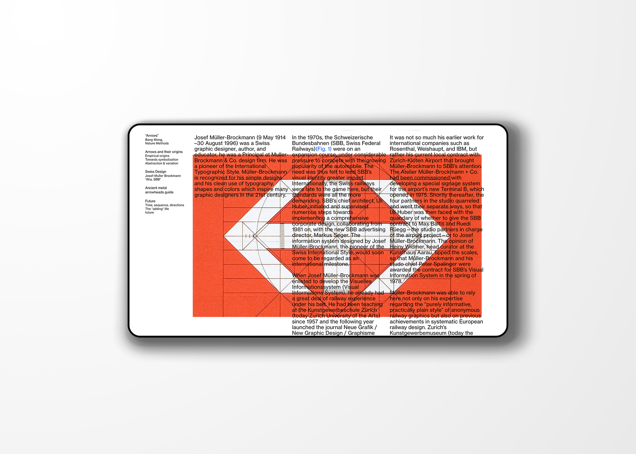
"Arrow, aesthetics and future"
As a designer, arrows are frequently used in my designs. So in this project, I traced the origins of arrows, from ancient arrowheads evolving into modern directional signs, carrying both modern and ancient symbolic meanings. From both a design and scientific perspective, for example, using the simplification process of Swiss design and considering the aesthetic and future trends based on the directionality of time and physics, as exemplified by Stephen Hawking's quote.
My design concept involves using a triangle as both the arrow's point and as a cover and back, pointing in two directions. Viewers can choose to start from the end, moving from modern to the past, or follow the sequence of cover-modern-past-future as a continuous loop. Each page represents a section dedicated to a specific topic, with the ancient arrowheads serving as guidelines in the middle spreads. Finally, I provide a summary and analyze the research findings at the end. I also experimented with different media, presenting the project in the form of a newspaper, poster, and website.
→ Website
Format: newspaper, poster, website
Jan 2023 - May 2023
