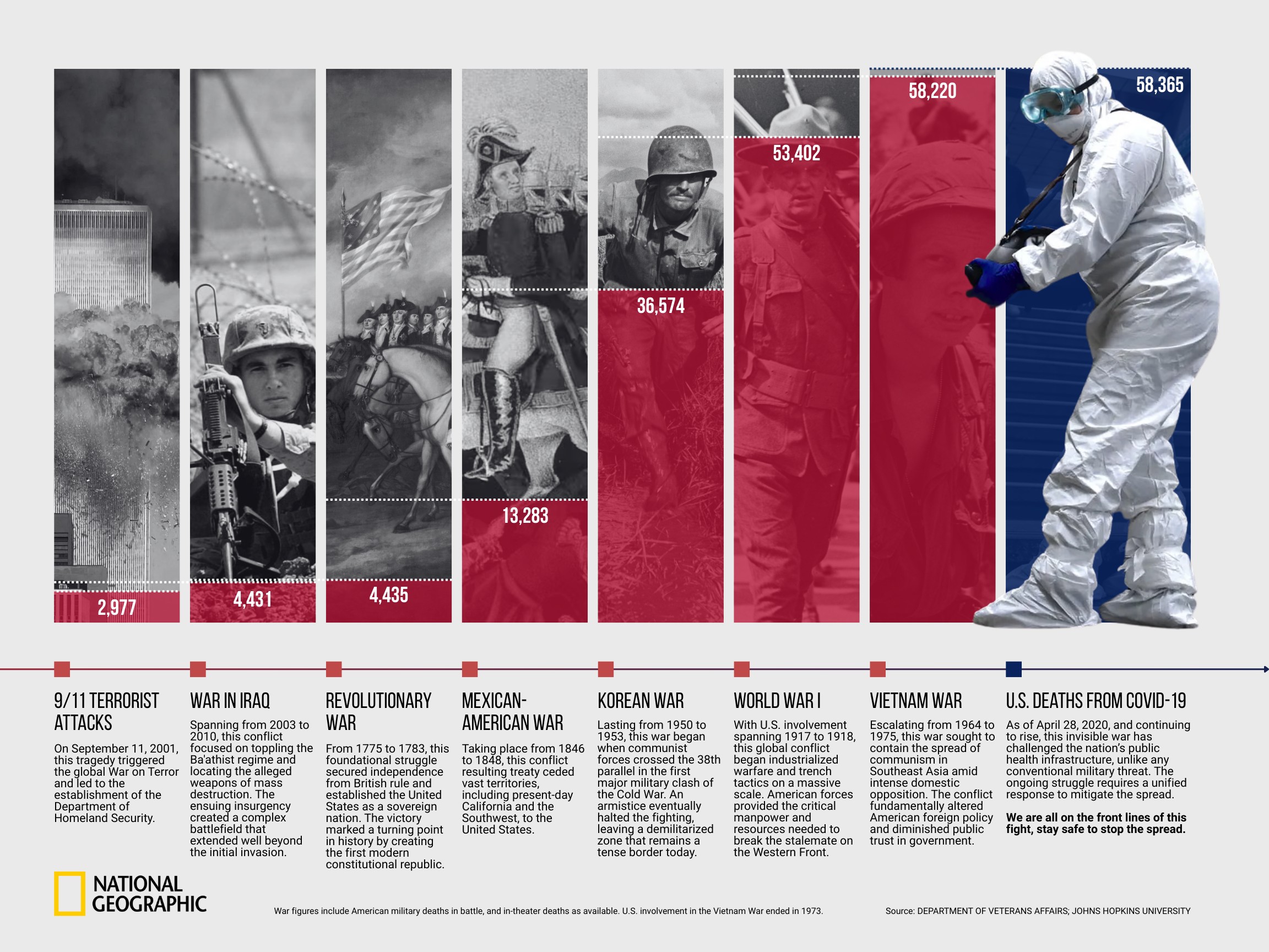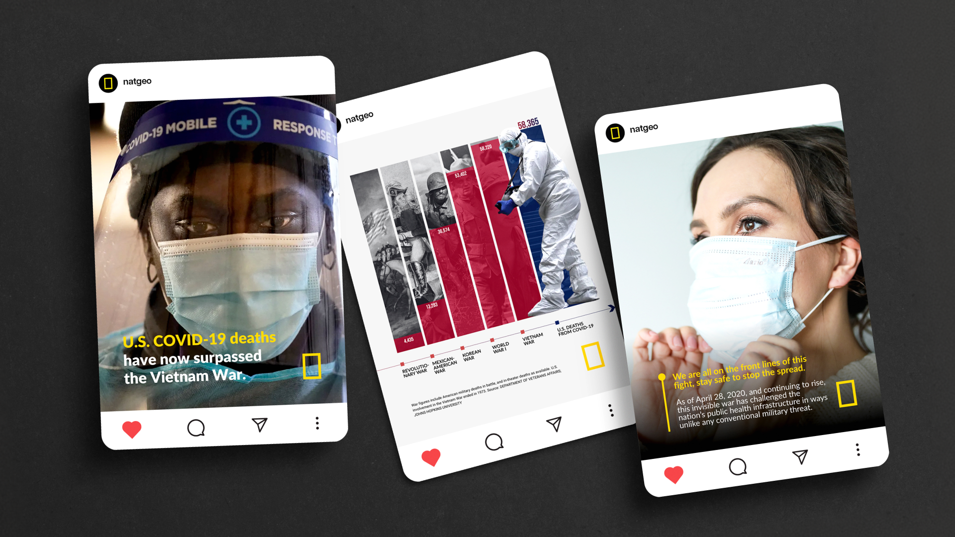
The color palette strategically pairs red for historical war casualties with blue for COVID-19 fatalities, a combination that evokes the American flag to ground the data specifically within a national context. To establish a clear temporal visual system, archival war photographs are rendered in stark black-and-white to signal historical distance and archived memory. In contrast, the pandemic imagery utilizes vivid, full-color tones to thrust the immediate crisis into the emotional foreground, emphasizing that this "invisible war" is an urgent, living reality.
© Xinyi Han 2026 All Rights Reserved


Graphic Design
Visualization Redesign | Social Posts | PSA
The Invisible War

Problem
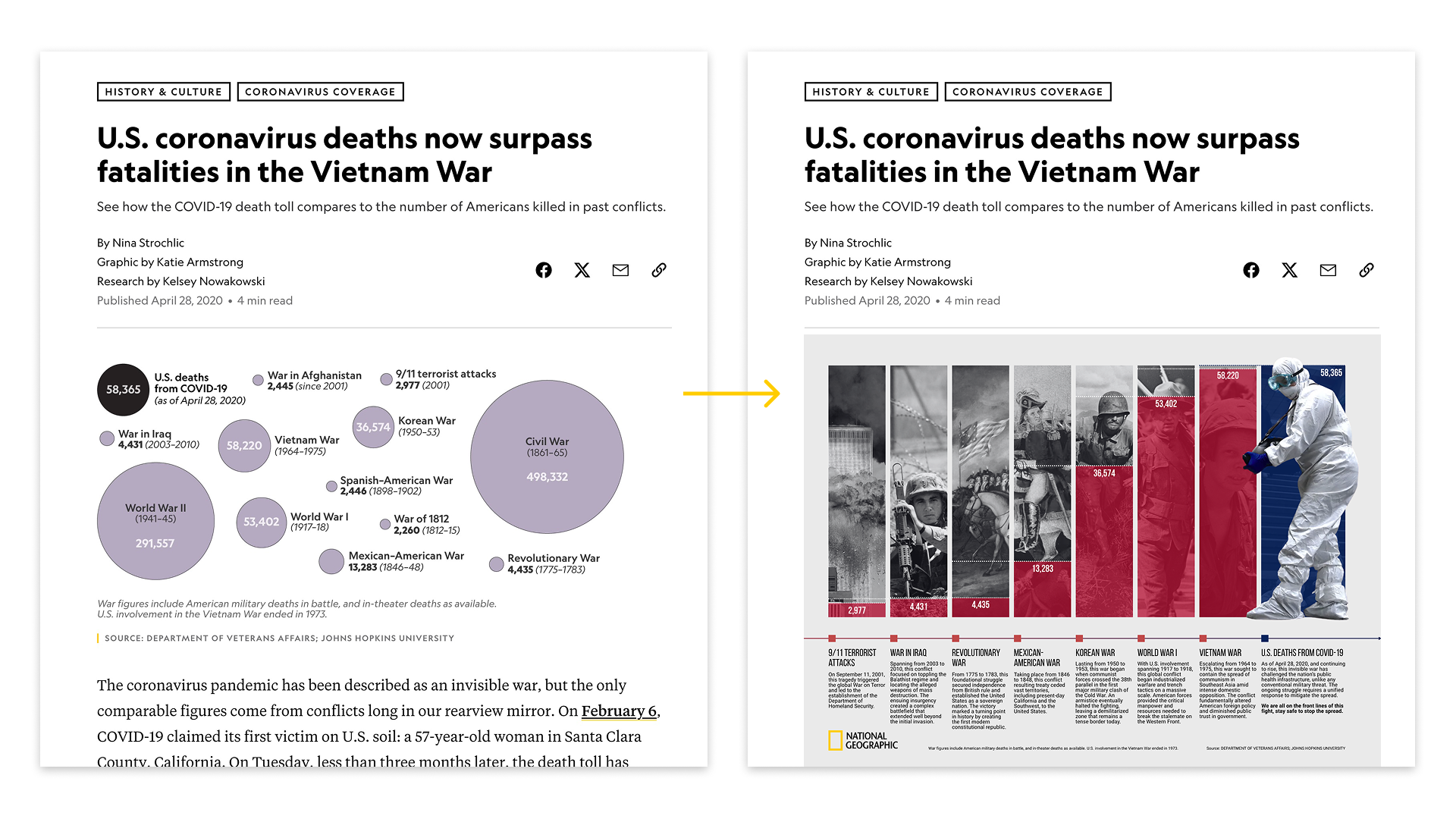
The original data visualization obscured the urgent reality of COVID-19's death toll through a confusing, non-hierarchical layout that failed to clearly communicate the data or emotionally engage the audience.
Solution
Redesigning the visualization with intentional visual hierarchy and emotional resonance, across high-impact digital platforms, including an Instagram carousel, a Reel, and a 60-second PSA, to maximize audience comprehension and drive immediate action.