Naked Fuel
Graphic Design
brand identity | packaging | advertising
Problem

Art Direction
© Xinyi Han 2026 All Rights Reserved


Naked Juice risks losing relevance with Gen Z consumers as the fitness and wellness market continues to grow, driven by increasing demand for health-conscious, fitness-oriented, and sustainable products.
Solution
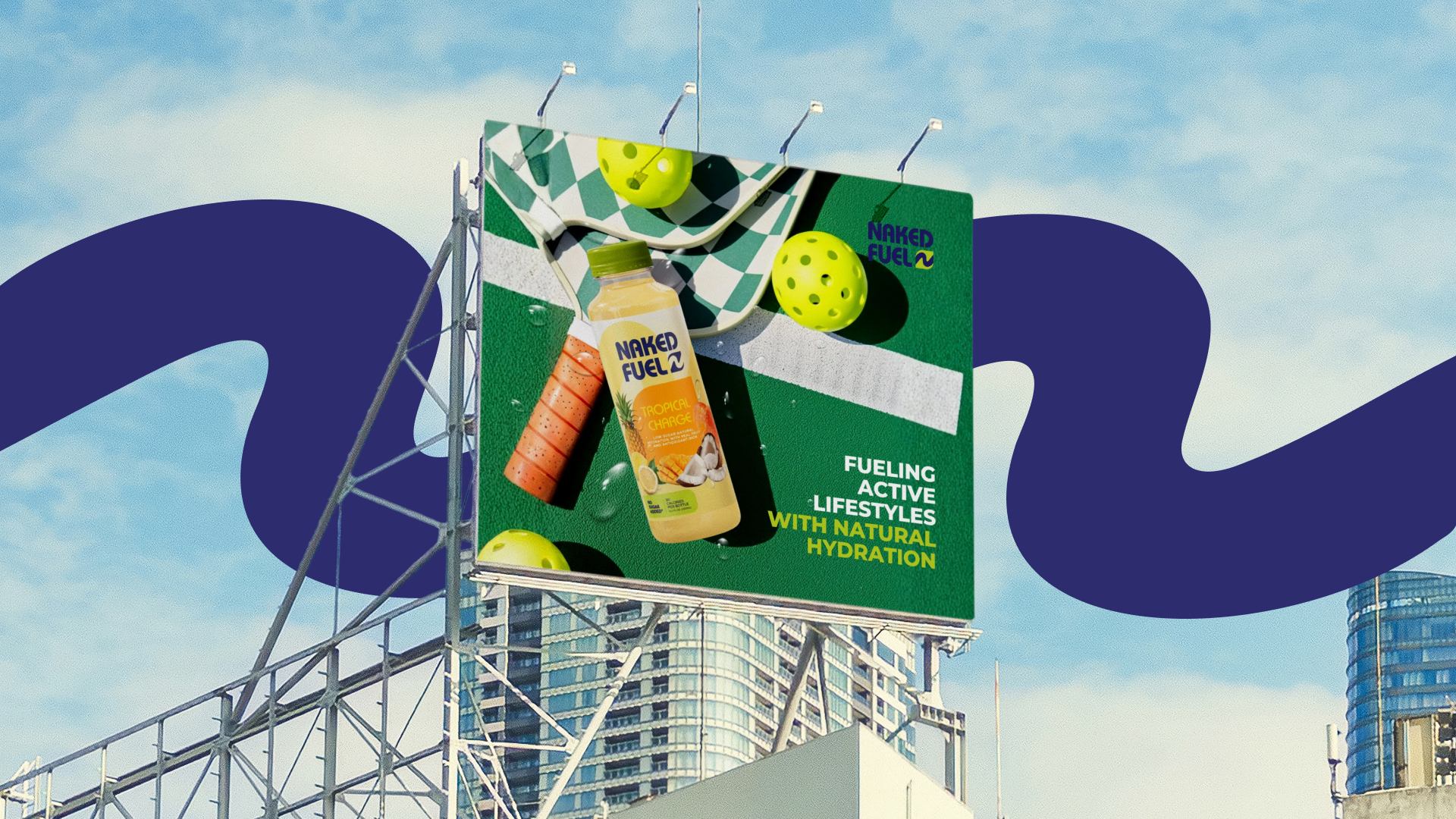
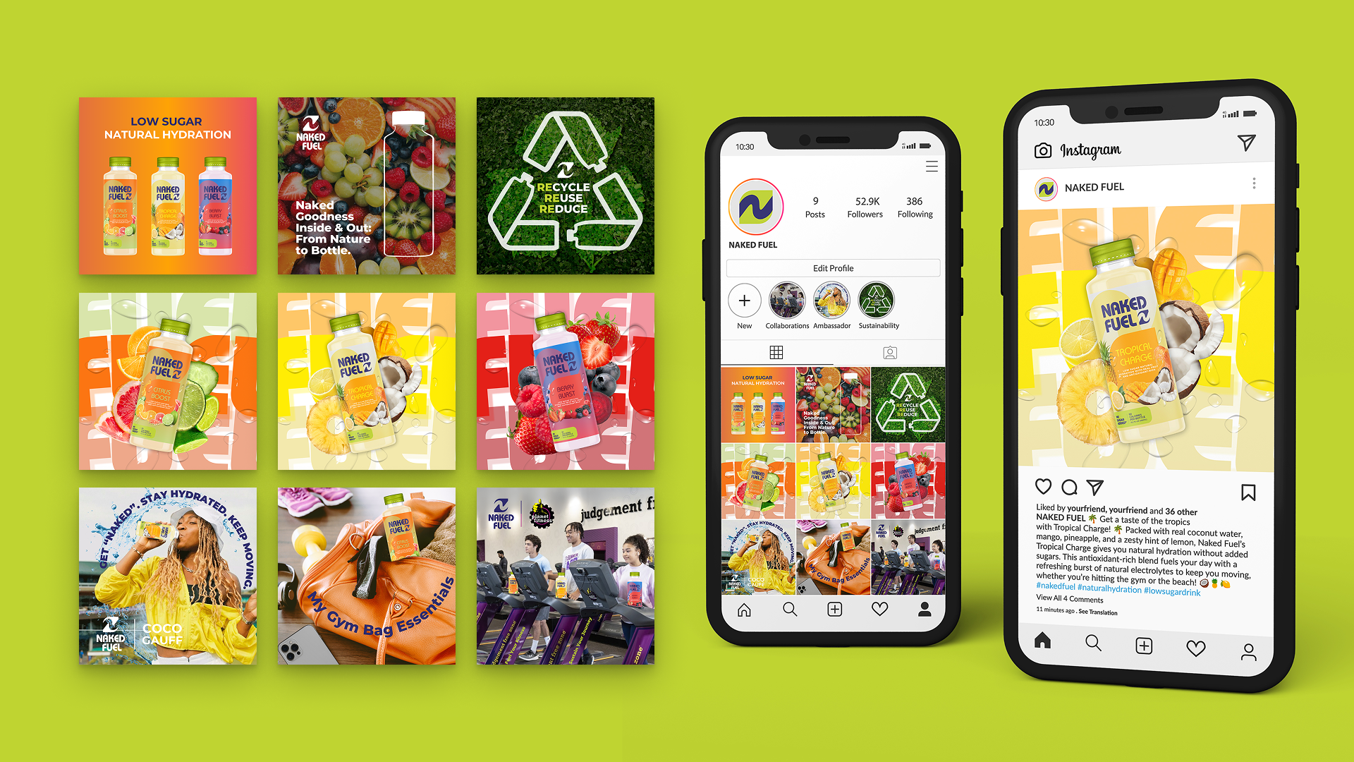
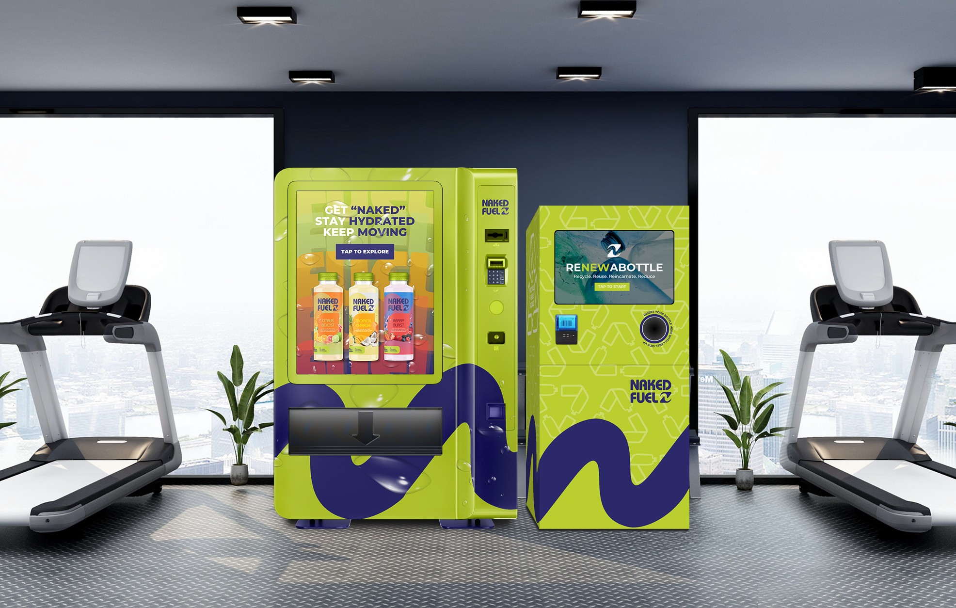
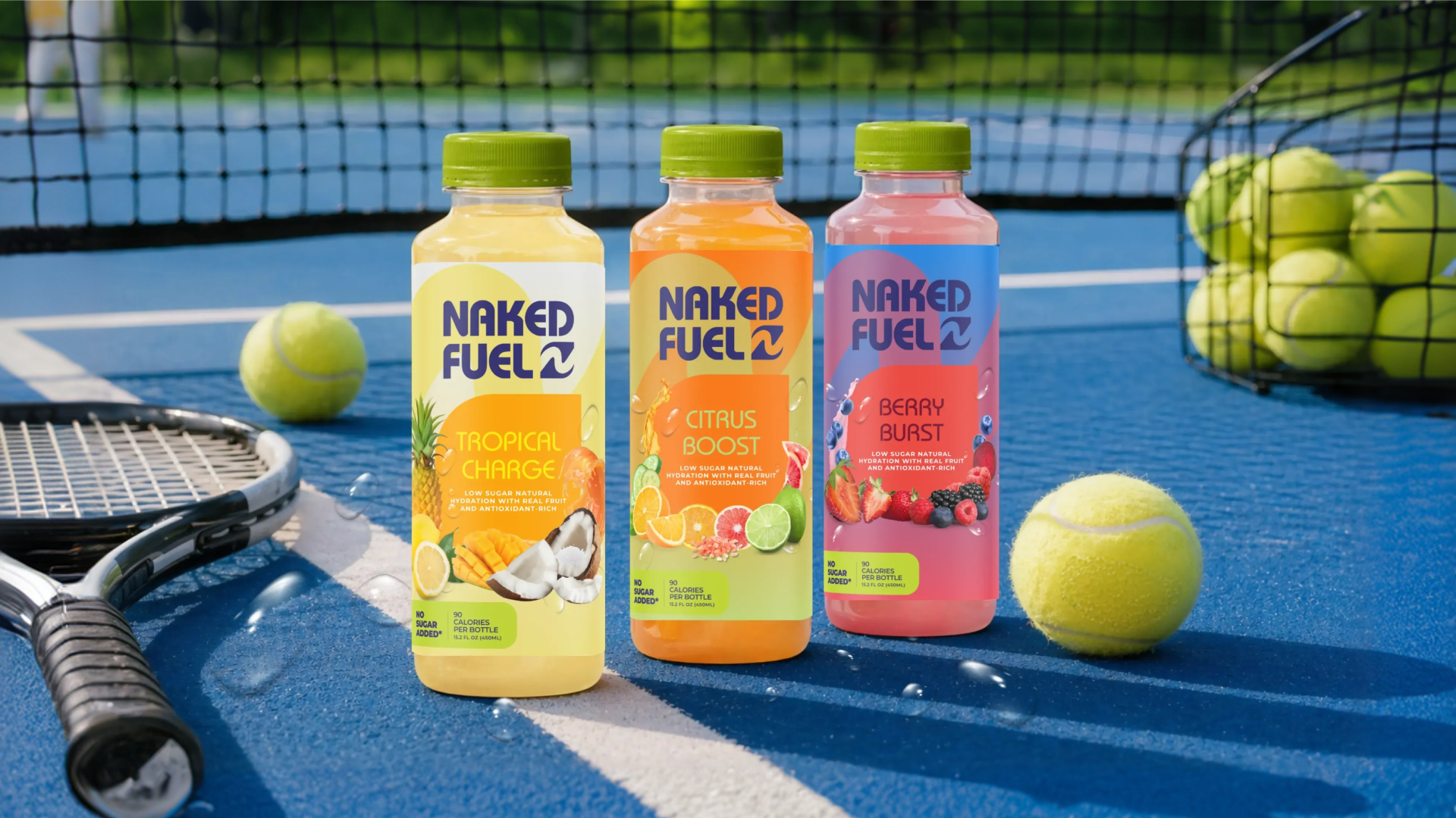
Naked Fuel expands Naked Juice into the fitness market through a new low-sugar, natural hydration product line designed to align with Gen Z’s wellness-focused and sustainability-driven lifestyle.


Existing brand equity + contemporary energy + wellness-driven clarity =
Naked Juice
Original Logo
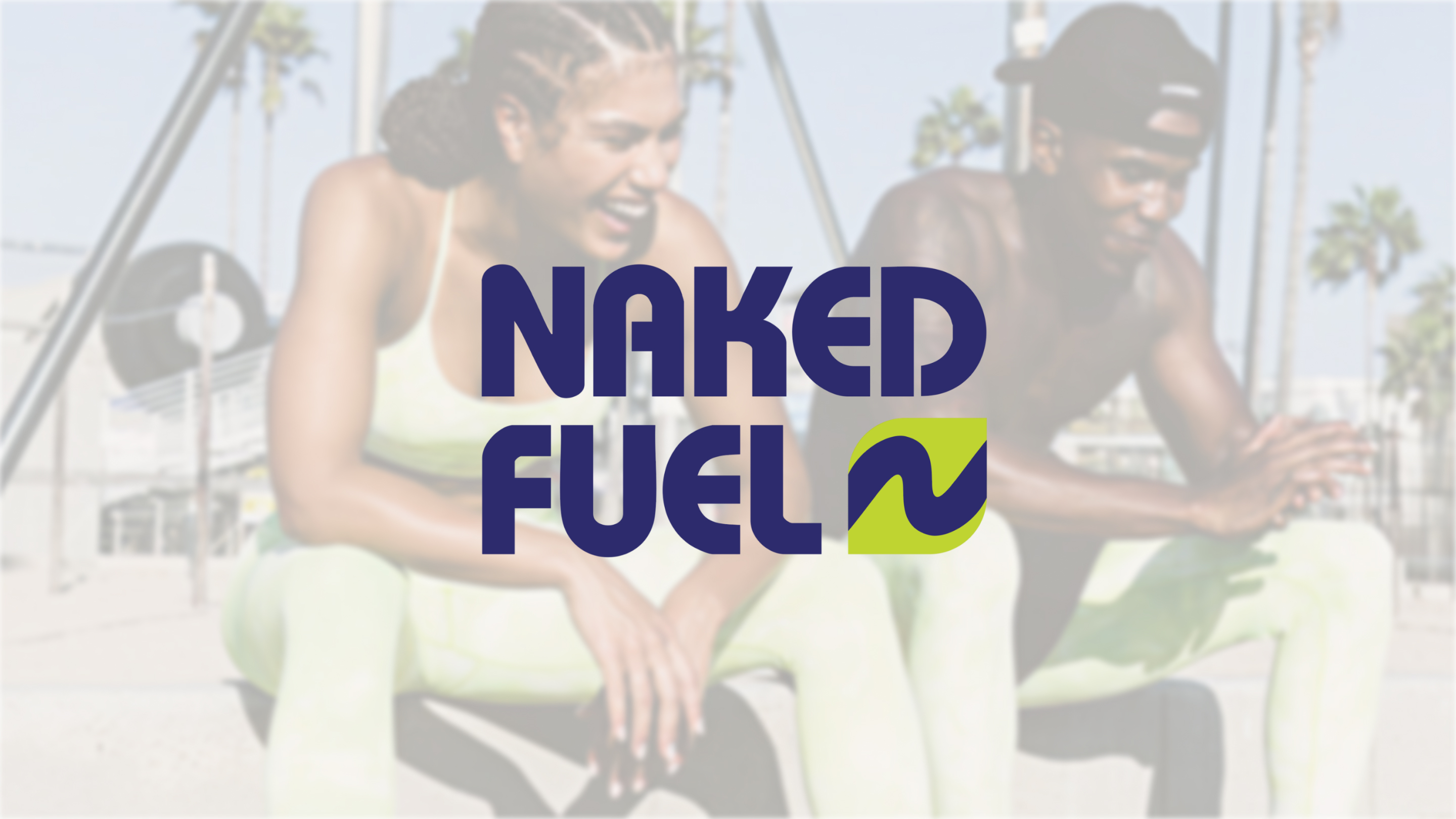
The Naked Fuel logo evolves the original Naked Juice identity with a more modern, bold typography, introducing a dynamic curved form to convey energy and movement, paired with a simplified leaf extension that reinforces the brand’s natural origins and its evolution into a fitness-focused product line.
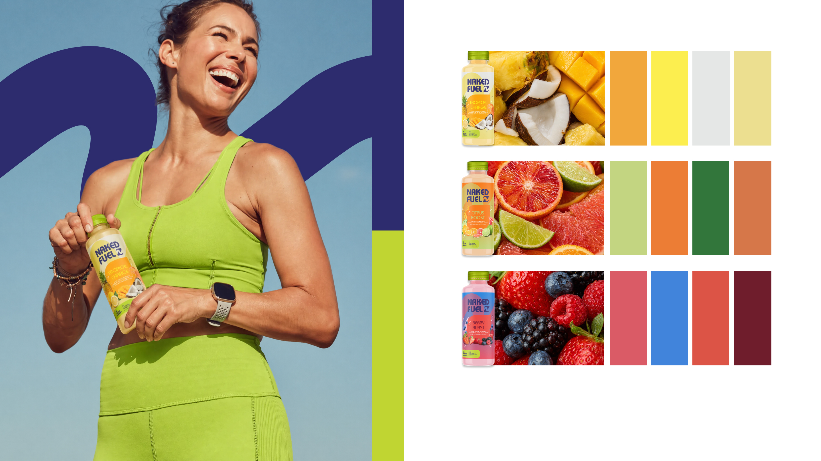
The color palette uses blue and energy green as primary colors inspired by the original Naked Juice identity to maintain brand recognition and convey freshness and vitality, while secondary colors derived from different fruit flavors add vibrancy and differentiation across the product line.